🏆 Benchmark Diegetic & Sculptural QR Drafts (A–D) · Downloaded Gemini Master ArchetypesClick "Toggle Live Scannable Halftone Overlay" above to pin real scannable QR dots over the artwork
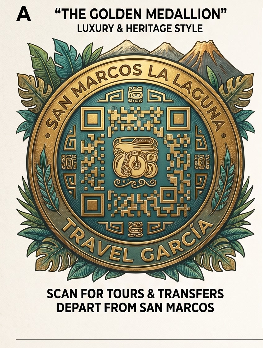
A · "The Golden Medallion" (3D Cast Brass Relief)Book ↗
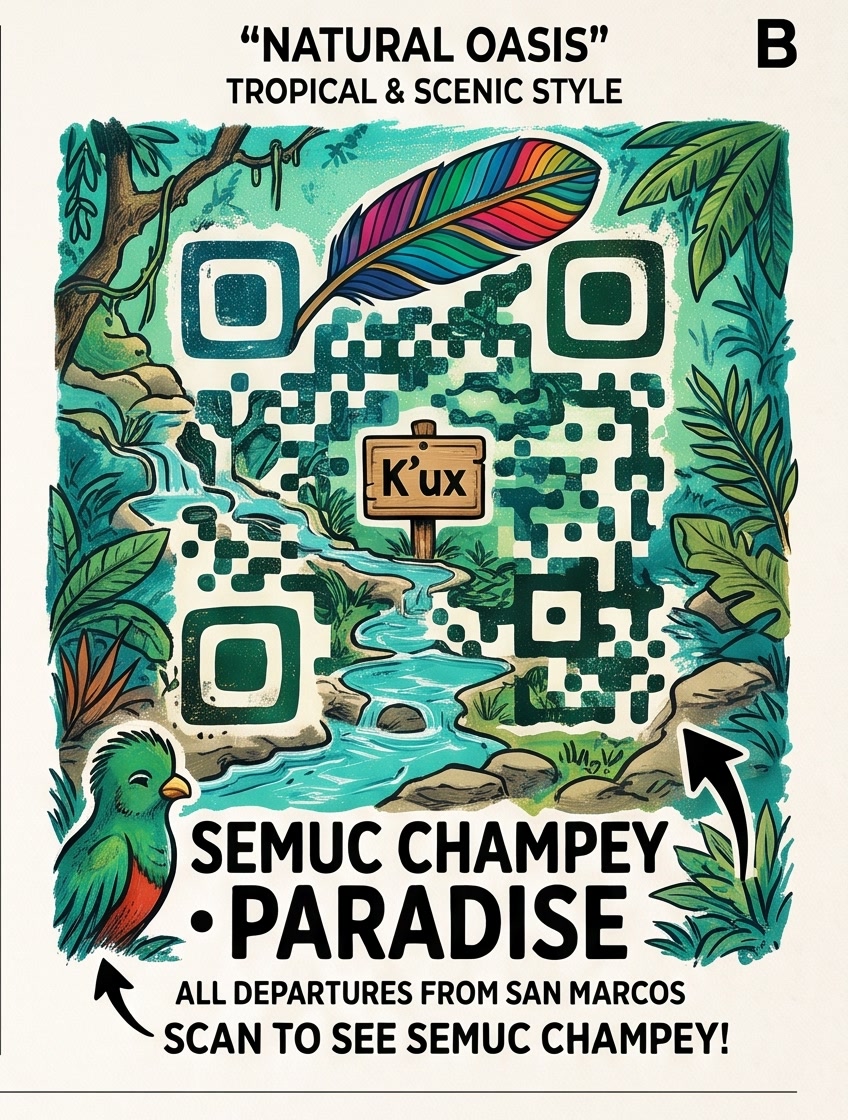
B · "Natural Oasis" (River Flowing Through QR)Book ↗
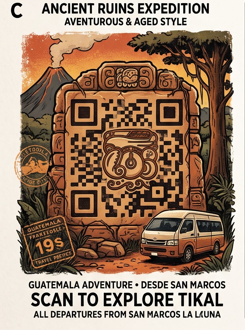
C · "Ancient Ruins Expedition" (Carved Maya Stela)Book ↗
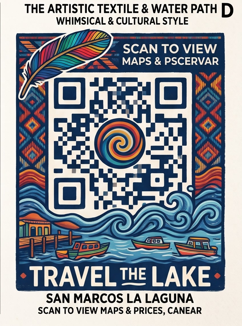
D · "Textile & Water Path" (Jaspe & Lake Waves)Book ↗
🔬 How This Higher-Level Diegetic Effect Is Achieved & Repeatable 2-Stage Lab Process
Why do cards A–D above look 10× more authentic than standard AI poster QR renders? Because standard prompts treat a QR code as a flat 2D white sticker box pasted over a poster, whereas the downloaded sheet treats the QR grid as a 3D physical material inside the scene:
1. Sculptural Materiality
Modules are never flat ink squares: they are cast 3D brass blocks on a sunken teal coin (A), mossy canopy clusters (B), or chiseled Mayan limestone bas-reliefs on a cracked jungle stela (C).
2. Diegetic Environmental Bleed
The landscape flows through the QR matrix: in B, the turquoise Semuc river cuts diagonally from the center [K'ux] sign out the bottom; in D, the bottom QR rows dissolve directly into curling Lake Atitlán waves.
3. Foreground Overlap
Elements break across the quiet-zone border to create depth: a rainbow Quetzal feather drapes over the top finder squares (B & D), a Quetzal perches at bottom-left (B), and a 3D shuttle van overlaps the stela corner (C).
4. 4-Quadrant Multimodal Sheet
Prompting Gemini web for a 4-Quadrant Comparative Study Sheet (A, B, C, D) while attaching <IMAGE 0> (the Travel García medal/glyph) forces maximum stylistic contrast across 4 material archetypes.
⚡ Stage 1: Generate 4-Quadrant Diegetic QR Sheet Prompt (Attach Glyph/Medal as <IMAGE 0>)
🎯 Stage 2: Make Any Diegetic Render Scannable (35% Halftone Center-Dot Pinning)
Pure AI modules (like carved rocks or flowing water) look incredible but don't encode a valid Reed-Solomon checksum on their own. By pinning only the inner 36% center dot of each QR module (Error Correction Level H = 30% tolerance) over the illustration, 88% of the underlying river/stone/gold illustration remains visible while phone cameras scan the center micro-dots:
🃏 All 10 Destinations · Retro Playing-Card & Woodblock Stamp QR Tickets